
It’s amazing what you can find on the internet and how much you can accomplish if you take the time and put forth some effort. Learning design principles? Let’s do this! I know this is going to help me be a better and more well-rounded person.
Flyer Project: Graduate Leadership Conference
Description: An 8.5×11 inch flyer promoting an upcoming conference/seminar.
Process: I first made a series of sketches to begin the creative juice process. I super suck at drawing and scale, so my primary goal was just on getting the very barebones framework in multiple ways to springboard to my software.
I used Adobe InDesign, a software I’ve never used before. Lucky for me, I’ve used other publishing suites and Adobe Photoshop regularly enough that I could get a running start. I learned some useful techniques thanks to advice from others and a plethora of tutorials on YouTube.
I chose to use a gradient of black to white for added interest, but to also symbolize the growth potential that we all face in life and in leadership. To lead is not something so straightforward, there are many shades of gray as you learn to handle things on a case by case basis. Absolutes and rigidity are not the signs of a good leader.
After some critiques by multiple friends, I tweaked my design until I reached the final product:
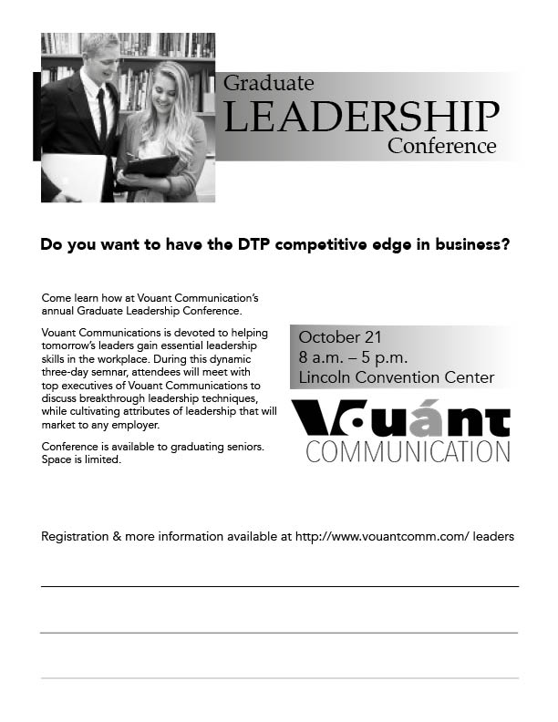
Check it out? Note: This is not a real event. I made stuff up. I don’t even know if that Convention Center is a real place. Who doesn’t like the name Lincoln? He’s got my favorite memorial in D.C.
Message: I felt the message here focused on “leadership”. I didn’t want people to think this was something relating to graduation. Leadership stands for itself and is a principle that everyone should learn, regardless of what they choose to do in life. It was because of this that I kept my flyer simple. One of the strongest lessons in leadership and life is “Keep it Simple, Scarecrow.”
Audience: The intended audience is college seniors, who now span a wide range of ages. Again, I felt that this called for something more simple and straightforward so as to appeal to a larger range of the audience.
Top Thing Learned: Adobe InDesign is a powerful piece of software, which comes at no surprise after my extensive work in Lightroom and Photoshop. It’s going to take me a while to become versed in even half of what InDesign offers me, so I need to prepare myself for a lot more tutorials and a learning curve. I already see some excellent potential for how I can utilize this program when I’m more comfortable in it, and I look forward to that process!
Credits:
Title Font Utilized: Palatino (Serif Style)
Body Font Utilized: Avenir (Sans Serif Style)
Logo Image
Graphic Image
Here’s a video commentary of me with a print out of my document. BTW, do NOT ask me about my trip to FedEx Kinko’s… it was NOT a happy experience:
Feel free to give me feedback in the comments below!
–Lady O

Great flyer, nice how you added the note space. You seem really comfortable with blogging. You really thought about your flyer and what the audience would see. I agree sometimes I just skip over the small print, so I like to see the eye- catching stuff and quickly decide weather or not I will go to something. I feel like you understood the gradient feature and it looks good on your project. Nice appealing fonts too. Good work.
angelamcomm.wordpress.com
I like this girls blog and how she did some projects.
LikeLike
Thank you! I have been online since the old Bulletin Board days and ran my own family website in the 90’s. I’ve been “blogging” since I before we had this great content manager software, so I suppose I am quite comfortable with it. It’s something I enjoy and a great outlet for exploring and improving myself and interacting with other people!
I’m glad I’m not alone in skipping small print. That is so refreshing and makes me feel better. It’s the one thing I found the most daunting, but I was dedicated to following through with the challenge accurately regardless of my own personal feelings. My eyes are jacked up, so I figure that sort of thing is just me!
LikeLike
Hello Lady Ozma!
Well done on the project. I really like your open honesty about how you created this project. It was nice to know that I’m not the only one that does not love sketching. Luckily, they are just used for a rough guide, right?
From you project, I especially like the asymmetrical balance you created with the picture and the logo. I also like the gradient that you used. Both of these things really grabbed my attention & drew my eyes in.
Keep up the good work!
Here’s a link to my site – https://kellystarrcomm.wordpress.com/
LikeLike
I really like your flier and the way you used the gray, black and white. The gradient is also a nice touch. The female in the flyer looks like she is taking on the role of a leader, so making the word leadership darker and larger next to the picture really makes it stand out to the audience. I also appreciated how you made the dates larger and stand out, keeping the important things the main focus. Nice job. Check out my project here: https://shellyvisualmedia.wordpress.com/2015/10/03/project-1-flier/
LikeLike