
You can tell where my brain is with this challenge. It goes right in line with all of my recent quotes from the recent General Conference of The Church of Jesus Christ of Latter-day Saints.
In this week’s challenge: I’m interviewing for a job that wants someone that’s good with Photoshop. I need to provide a sample of my work with an original photo, text, and some basic design elements.
I knew immediately what I wanted to do. Honestly, I’ve been waiting for the perfect opportunity to use this photo in something. Plus, I had a week that was not conducive to another photography shoot. Sometimes, I’m just not allowed to have “recording devices” for 12+ hours in a day. Sorry, NDA.
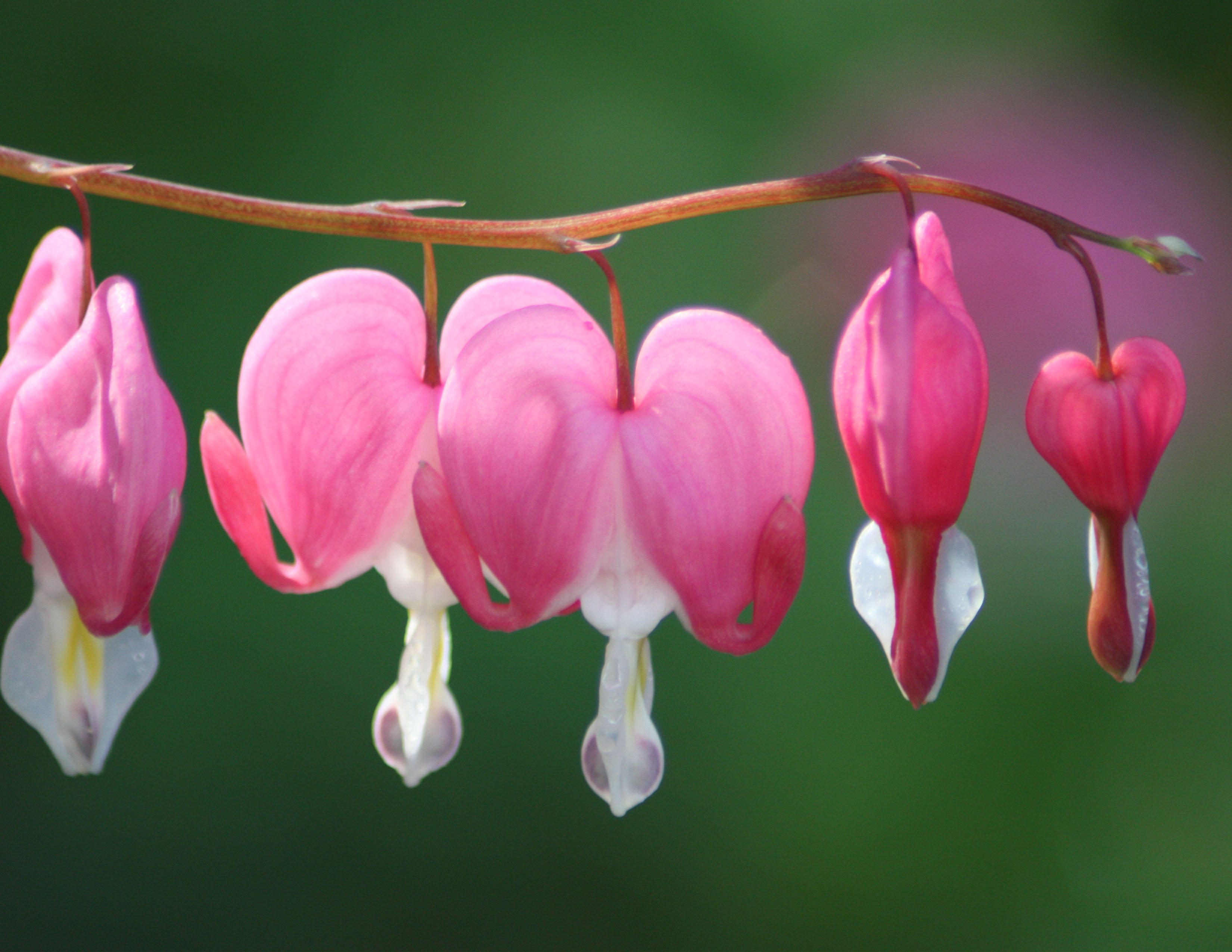
Bleeding Hearts are gorgeous.
For those who do not know, I was invited to participate in an exhibit at the DC Temple Visitor’s Center a few years back. We were on a time crunch and I took this photo and prepped it for hanging in under three weeks! The photograph was taking on the grounds of the Washington, D.C. Temple.
I didn’t really have a good plan for what to do with this picture (which hangs larger than life in my house because of that exhibit), I just knew that I wanted to do something with it. Then I read this challenge and thanks to Sister Marriott’s recent Conference address, inspiration hit!
Here’s my project:
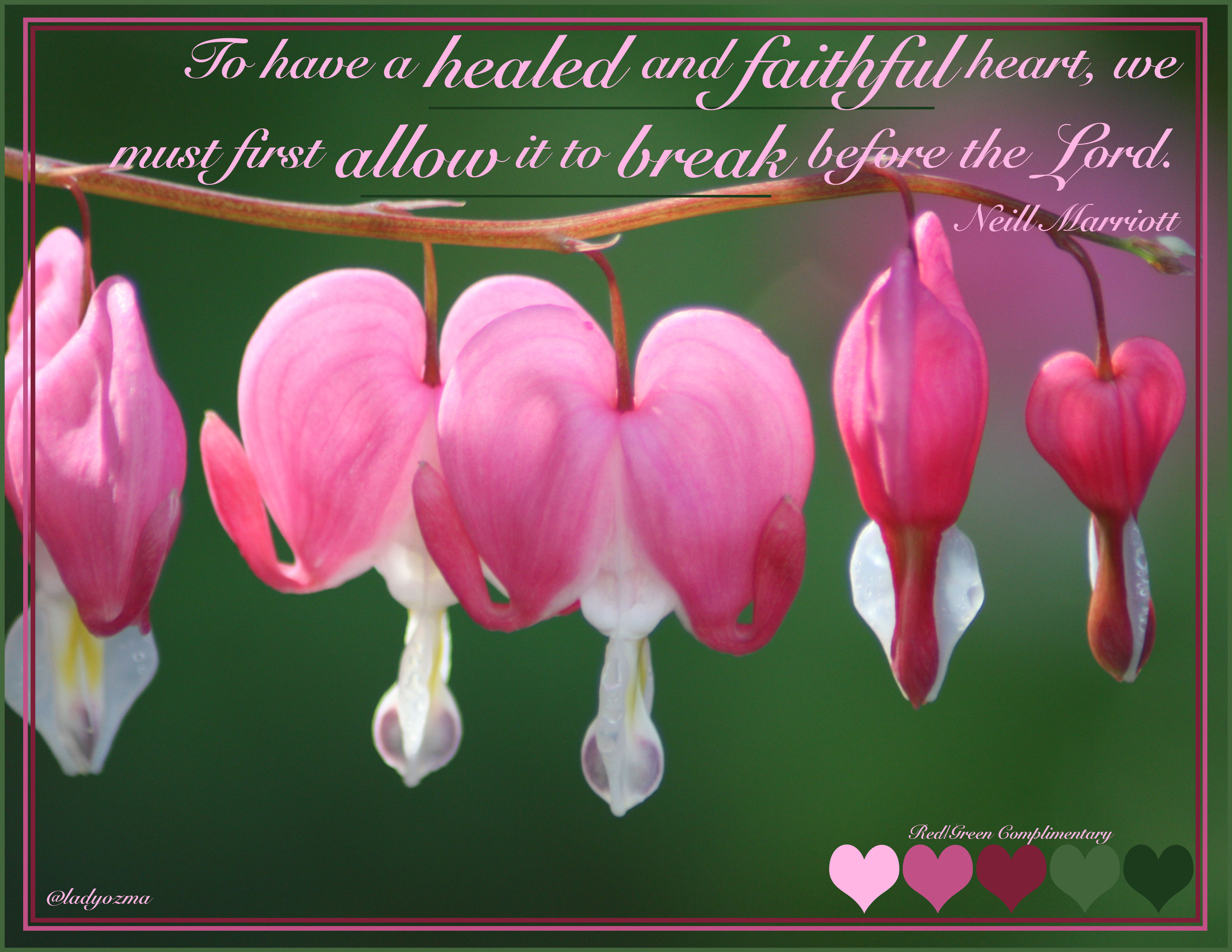
I love bleeding hearts. They look broken, yet they are beautiful. It’s their very brokenness that makes them what they are. We can have our lives smashed into a thousand pieces, but we come back better and stronger for it. When we give up trying to be strong beyond our capabilities, we find true healing. The message I wanted to convey was how allowing yourself the weakness of a broken heart can truly bring healing. It feels ugly, but it’s one of the truest forms of beauty.
I used a script font, Snell Roundhand Bold for the text to make the message feel more personal. I also used a Red/Green complimentary colour scheme for the accent pieces.
I tried a lot of different things, but I kept coming back to the simplicity of the photograph as the full background. There was really no need to muddle things up with anything more, and I felt that it distracted from everything else. Instead, I chose to simply make a faux matt with my three outline boxes.
To show my colour scheme and further design, I opted for the heart shape tool, to match the photograph’s bleeding hearts. I situated them in the lower right corner, out of the way of the greater design, again as an effort to not detract. I added my signature very small to the lower left so as to keep this in my portfolio going forward.
I love the Adobe suite of software. It was fun to only use Photoshop for this challenge as it’s been a long time since I’ve used that exclusively. It took me a while to remember how to do certain things in Photoshop.
Feel free to leave comments! I would love to hear your thoughts!
–Lady O

I absolutely love how well this project came out, Lady Ozma! The colors were bold enough to pull one’s attention directly to the phrase that was included. I appreciate how well you pulled together your phrase with the soft, flowing font that added an elegant flare to the finished project. As always you have created a one of a kind piece of art that I would not only proudly display in my own home but one that I feel could be worthy of being placed inside one of The Lord’s Holy Temple’s. Bravo! I am very excited to see future works from you!
LikeLike
Awww, thanks! It’s still an honor that this photo hung in the Temple Visitor’s Center in DC. I mean how do you go wrong with a photo that is requested to hang at such a prestigious location? You really can’t. I don’t get the time to shoot like I used to, and landscape was never my thing, but this was a great honor for me.
Thank you so much for your kind words. 🙂 I’m glad that everything came together in such a way for my viewers!
LikeLike