
Photoshop and The GIMP both offer stellar abilities to merge graphics together. Mastering this sort of splicing could prove advantageous for many reasons. I really enjoy bringing multiple images together to create something completely new.
This week’s challenge involved creating a montage of two or more graphics, with text, to create an 8.5 x 11 project with a spiritual theme. I can rock this because I’m still on that General Conference high.
The hardest part was selecting photos. Once done, here’s what I did:
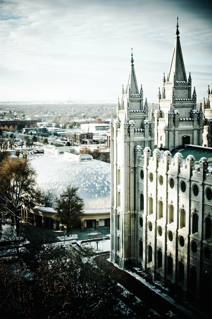
Step 1: The background
I chose my background: The Salt Lake Temple as seen from the Joseph Smith Memorial Building’s tenth floor. I love this view of Temple Square! This photo, taken several years ago in winter, is interesting. When I sat in Lightroom doing my whole workflow scene, I hit the wrong button in an attempt to just fix the color. I shot this picture through a tinted window so I needed to adjust the image to look natural. I ended up with this eerie color scheme that just “does it” for me. I quickly saved a copy and went back to my planned edits. Sorry, it was a pure accident so this is not information I have good details on from Lightroom.
I opened my image file in Photoshop and then selected the crop tool. I set my size to be 8.5×11 inches and then slid my crop frame to where I wanted it. A hit of the check mark and my photo no longer fit to 4×6 multiples.
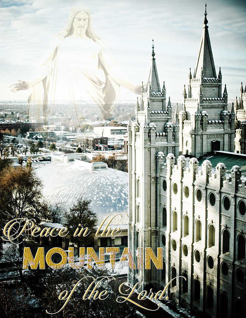
Step 2: The Christus – Selecting and importing
I love The Christus statue. I can’t guess how much time I’ve sat at the feet of a replica of the statue in the Visitors’ Center at the DC Temple. I opened a photo I had of this statue in another Photoshop window. First, I chose Image Rotation – Flip Canvas Horizontally. After that, I used the Magnetic Lasso with a feather of 100 to select the statue. I switched to my Move Tool and dragged the selection to the window of the Temple.

Step 3: Masking The Christus
Using the layer window, I made sure my Christus layer was active. At the bottom of that window is the masking tool. Once a mask was active, I painted black to clear out the base and feet of the statue. With the photo zoomed in, I could also work on any dark pixels that made the move as well as soften the edges of the Christis for blending into the background for the montage effect.
With a large amount of zoom in place, I was able to also mask the hand of the Christus to the spires of the Temple, making it appear as though His hand is behind the spires.
Step 4: Drop The Opacity Of The Christus
Each layer has an opacity setting on the layer and I used the slider for the opacity until I felt it look sufficiently blended. I ended up with a 62% opacity in case anyone wants to know.
Step 5: Cut The Background In Better.
To make for a better merge, I selected the Christus using my magic tool and then swapped to the background layer. A quick copy and paste from that background layer into a new layer above the Christus and I could enable a cleaner bled between the Temple and Christus photos. I also knocked the opacity of this layer to about 40%.
Step 6: Typography
Fonts used: Candlescript Demo Version Regular and The Bold Font Bold.
After selecting these fonts and putting the word layers in place, I used the layer effects to help give the lettering more interesting. I worked with a gold colour from the spires of the Temple as I worked through the effects. I wanted that shade for everything it symbolizes with the thought of the Temple.
I arranged the word Temple first, as I wanted it to be my primary focus. From there I arranged the two phrases using my smart guides so the P in “Peace” and the d in “Lord” matched up with the first and last letters in “Mountain”. I locked the three layers to each other and moved them into place. Not only did I utilize the layer effects with things like bevel, emboss, and the like, for Mountain I changed the layer from a normal blend mode to “lighten”. To ensure that my two phrases had the same layer effects, I actually just did a straight copy layer effects from one to the other.
The kerning for my The Bold Font looks off, but I do not have the software to accurately fix this problem. I did the best I could with the limited resources in Photoshop by placing my cursor between each letter and selecting the kerning box in the typography settings. From there I pressed the option and left or right arrow keys in order to adjust the kerning manually. It’s not a perfect or permanent solution, but it looks better.
The Final Product:
And here’s a video where I show off the printed product:
-Lady O

I really liked the sharpness of the original photo of the temple. You did a good job in blending the image of God above to the left, and not centering it. I thought the quote was very good, and I really liked how you made “Mountain” in a different color in order to have emphasis. I would only suggest to use a black mask behind the text so that it’s a little more clear to see. Good job!
LikeLike
I thought about it and tried it, but I didn’t like how unbalanced everything looked with it.
LikeLike
Hi, Lady Ozma! I really like the message you chose to share. I think the font you used worked really well in your montage. And the Christus statue looks well blended. Good job!
LikeLike
Thanks! I worked quite hard on this project. As for the message – I very much needed it last week, so this was quite personal.
LikeLike