
It’s time for some more quote graphics inspired by the most recent LDS Conference. Did you enjoy last week’s posts from Saturday Morning and Afternoon? If so, feel free to pin and share!
Today I’m posting three that I made from Sunday Morning’s session. I’m going to do the special Priesthood and Women’s session after I get done with the General Sessions. It’s taking a lot of review to get through these, now that we have the actual talks for me to verify wording!
I’m only posting three today because I skipped President Monson’s address altogether. I want to do a special matched set for his address. I haven’t made a “set” yet, and so this is taking some work to decide how I want them to all look. I’ll post about that when I’m done!
First up in today’s grouping is 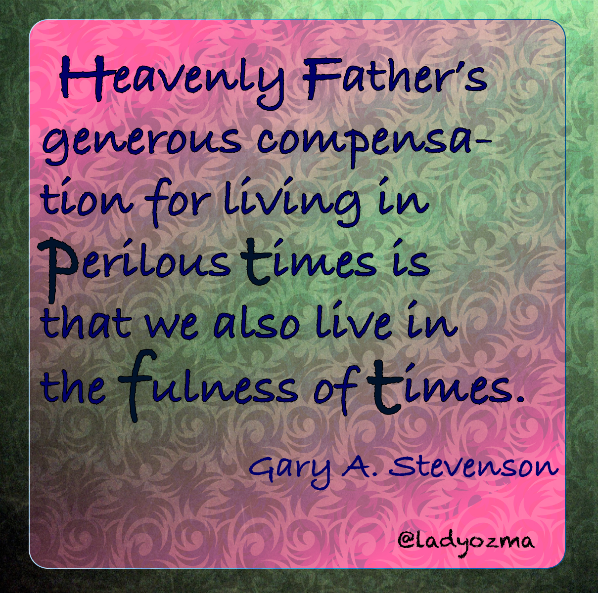
I used a series of techniques with this one. I’m not sure how I like it, but it was a total experimentation in Adobe Illustrator. You can see I used that touch type tool again. I also did an interest pink radial gradient. I felt it needed some texture, which led to the swirly thing as another portion of the background. That’s a blue swirly thing that I gave a lower opacity setting. Finally, I rounded the corners of the pink box as I experimented. There’s a lot going on, but I learned a lot. However, there’s also a lot going on with “perilous times”, so I guess it fits.
Font used: Bradley Hand.
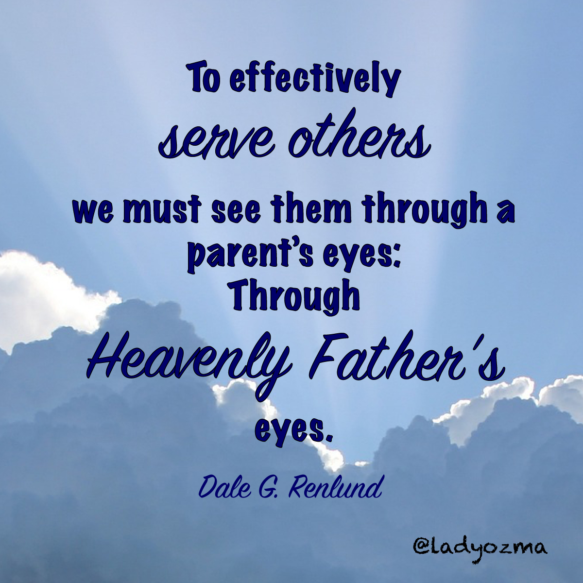
I love this quote by Elder Renlund. I often find that when I refocus myself to look through Heavenly Father’s eyes, I see the world and people in a different light. I’m nowhere near perfect at this, but I try. It’s definitely easier to serve when you look at people through this way instead of judging them by our worldly standards.
I knew I wanted a background with light filtering through clouds for this and I chose this picture from Pixabay because I liked that it’s dark towards the bottom of the clouds and the light bursts forth going upwards. I felt this was indicative of the darkness we see through and how we need to break free to see through the brighter vision of Heavenly Father.
Service is also something that Heavenly Father wants us to do and how we act as His hands here on Earth. I gave these prominence through the use of an alternate font and I like it very much.
Fonts used: Marker Felt and Signpainter Housescript.

Lastly, Elder Schweitzer gave this sage advice and it spoke to me. Where are our motives? Are we actively seeking to impress people or inspire them? This fits right into my “Look up, reach up, get up, lift up.”
I only Touch Typed the T and D in True Disciple. I felt “True Disciple” was more of a moniker, necessitating the uppercase D. I then chose to highlight “desire to impress” and “not just impress” through not only an alternate font but font color.
Fonts used: Iowan Old Style and Apple Chancery.
I’ve discovered I really like that Apple Chancery.
As always, feel free to comment with your thoughts and your requests. I will post another set on Wednesday from Sunday Afternoon! I look forward to your feedback.
–Lady O

Pingback: Scripture Meme for your “Hump Day”! | Lady Ozma's Journey
Pingback: Pinterest Thursday – Quotes Love | Lady Ozma's Journey
Pingback: #LDSConf Memes – Sunday Afternoon Quotes! | Lady Ozma's Journey